Commercial Branding Work
The design focuses a flat design style, expressing bold and strong tones yet appearing professional for the clients purpose.
The consistent house style is applied over all social media platforms, as well as over physical business cards, email signatures, and letter templates.
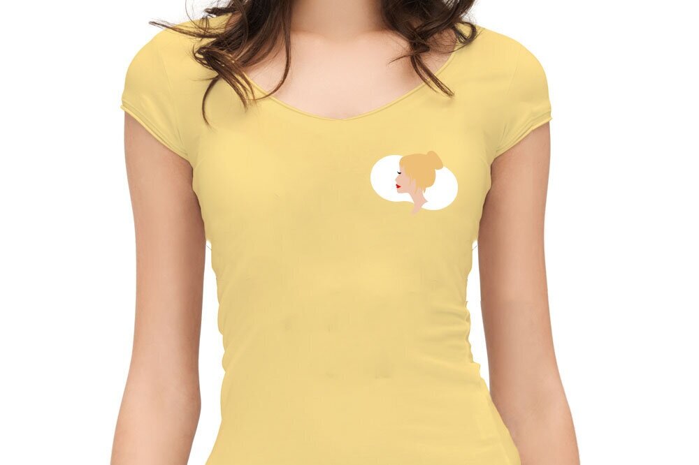
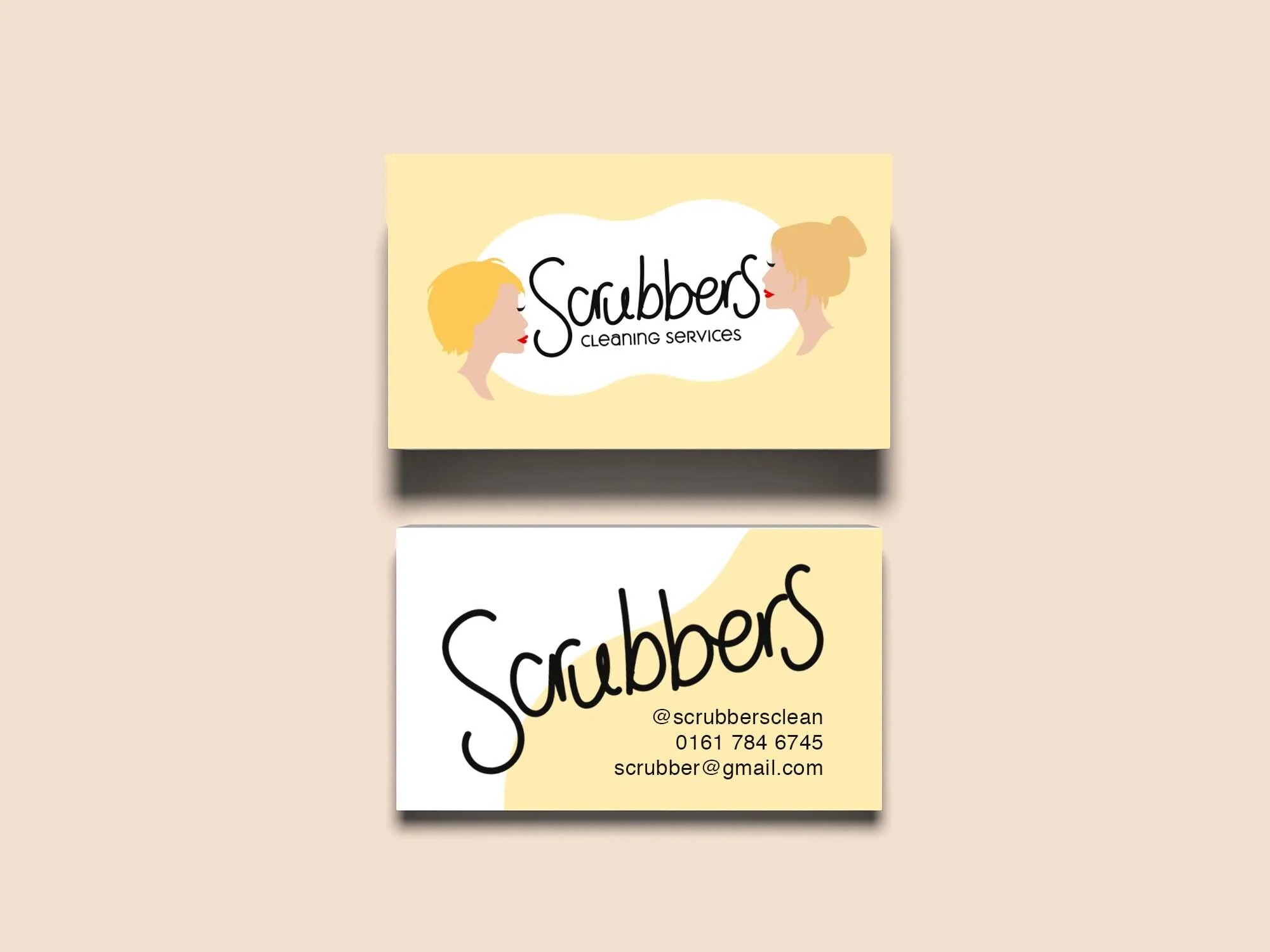
The brand aim for logo with heart. Rather than clinical they wanted a warm, friendly home-made style for their brand.
The illustrations are based of the images of the the clients themselves. Simplified to work at different sizes, and on social media.
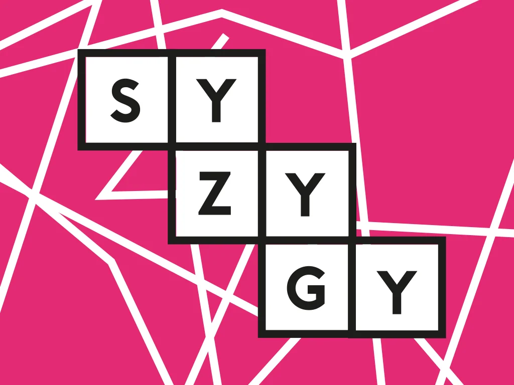
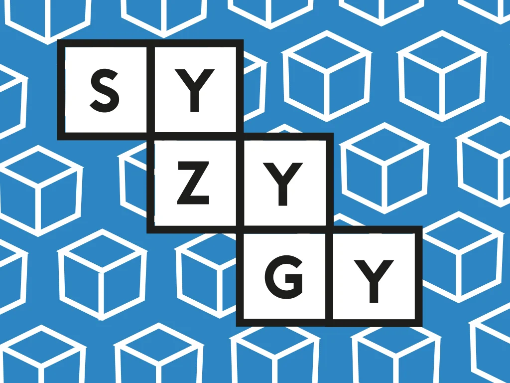
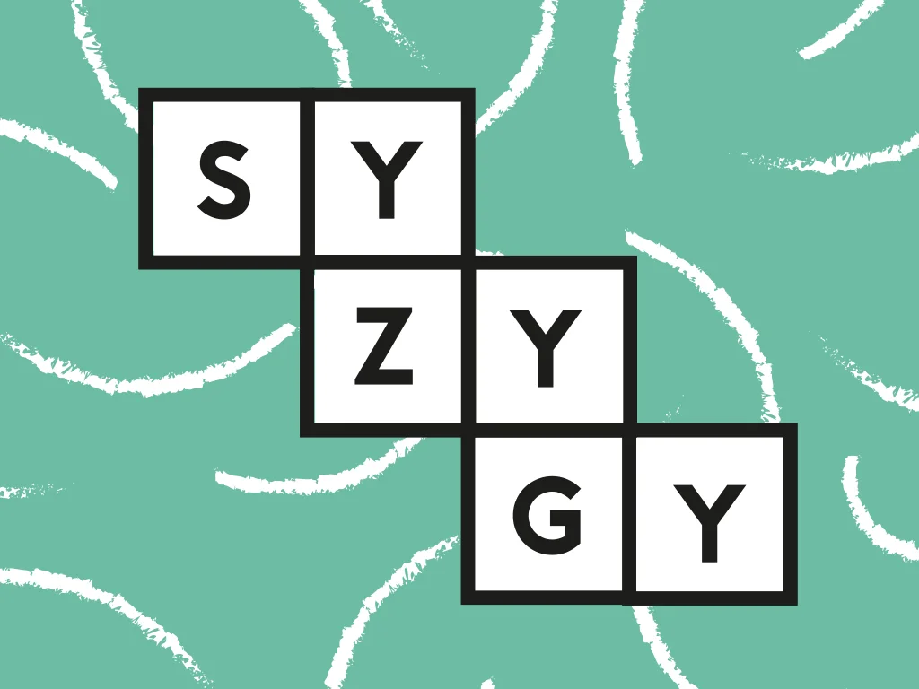
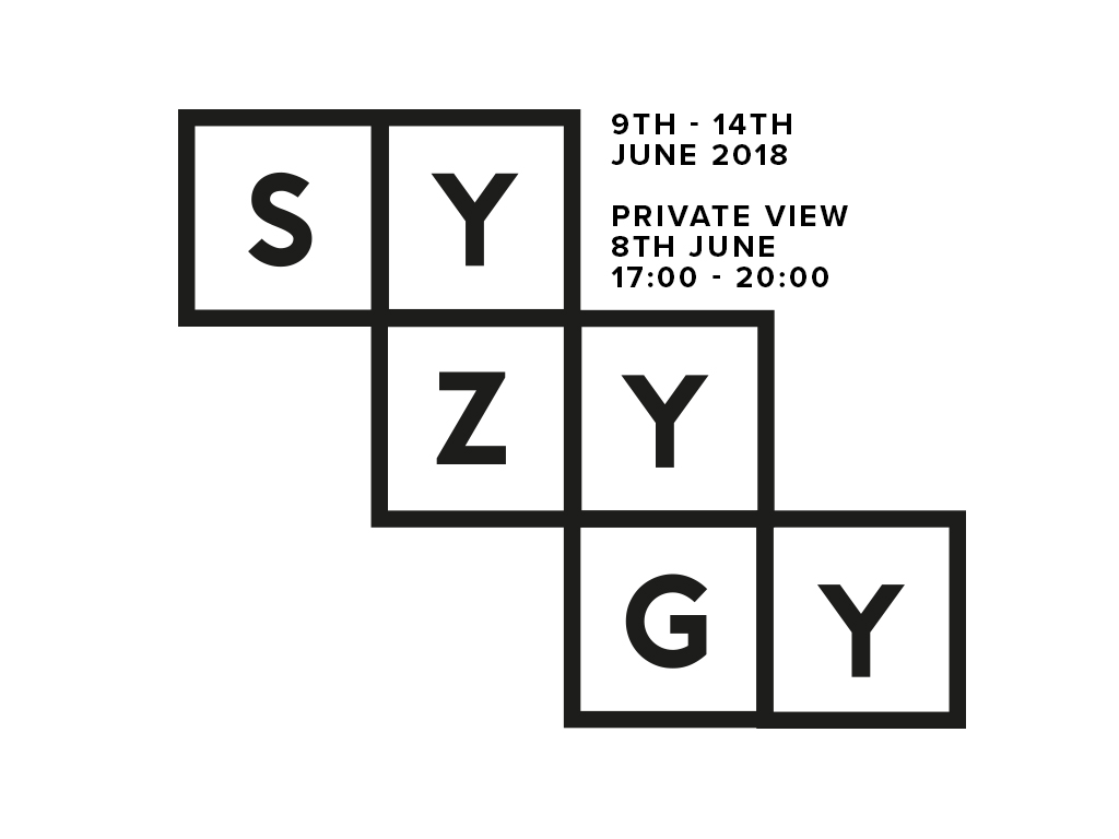
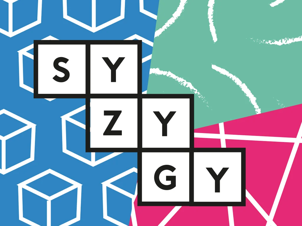
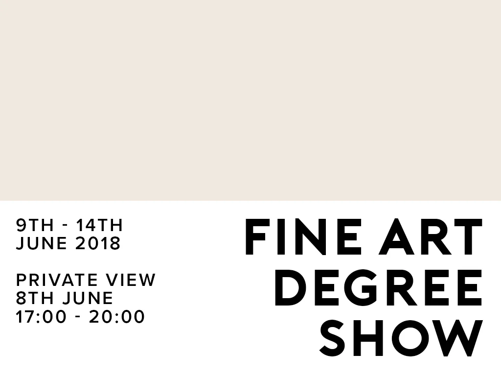
SYZYGY is the branding for the LUA BAHons (Fine Art) Degree. The show showcase a range of work from the year, different styles and ideas coming together in a singular event.
The course has a very wide range of idea for the branding, the logo therefore take a form . The letterform can move, adapt for its situation around the different shapes of the work.
The 3 different pattern represent the 3 main disciplines ;paint (brush strokes), sculpture (boxes) and 3D designs (lines).
Logo for social media, shows all the disciplines connecting together. Also works small, so suitable for the format.
Other social media piece, to work along side the busy vibrant logo and any of the more busy pieces.
Branding project for Photography Graduate Olivia Marshall, to be used at her graduate show.
A range of fit for purpose outcome where created to help the graduate express her professional nature.
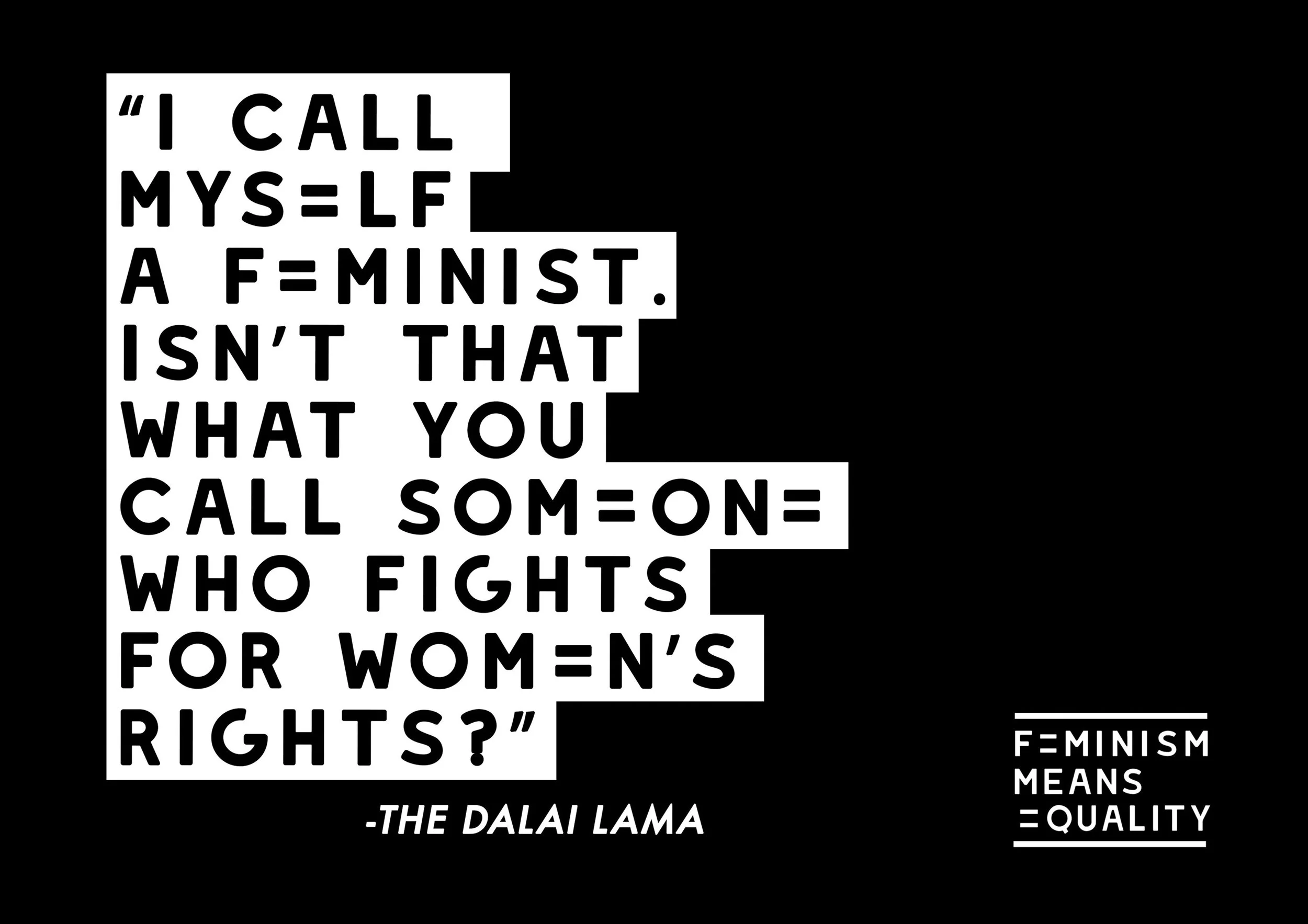
This project was created with the aim of to combating the current defined stereotype of feminism.
Very legible uppercase yet soft font was used, to work communicate effectively in crowds/demonisations yet not appear aggressive.
A wide set of posters where created, all following the house style and use of a singular colour to be easily and cheaply mass produced via screen print.
The range of posters take different forms, landscape and portrait to fit different uses.
The client aimed for a branding that was eye catching and stood out against the normal business cards around saddleworth.
The bee links to the brands name, and also the Manchester Bee as the client is based in manchester.
The blog tackles social issue, the aim for the logo was to portray no common stereotypes or ideologies yet be welcoming to all.
Typography used was inspired by the name, and was inspired by ‘bubble type’ trend of the 90’s.
The logo was used across the blogs social media as well as on the blog it’s self, and on business cards.
The bubble type was very suitable for the content, as it worked well at different sizes. The uniqueness of the logo made it easily recognisable.